No products in the basket.
Should your logo have a dark‑mode version?

Should your logo have a dark‑mode version?
Dark mode isn’t a trend anymore—it’s how people actually browse. From iOS and Android to macOS and Windows, interfaces default to darker UIs in the evening and often all day. If your logo only works on white, you’re forcing your audience (and your designer) into awkward workarounds—glows, boxes, or washed‑out colours that dilute your brand.
Why dark‑mode matters for brand consistency.
Real usage: A growing share of your audience sees your brand on dark backgrounds—mobile OS settings, OLED screens, and apps like Instagram, YouTube, X, Discord, and Slack.
Legibility & accessibility: High contrast improves readability and meets WCAG guidance. Low‑contrast marks get lost, especially at small sizes.
Context switching: Your logo should look intentional whether it’s on a website header, a Reels cover, or a YouTube end card.
What “dark‑mode ready” actually means.
Colour system, not a single hex: Define primary, secondary, and neutral pairs for light/dark. For example, a brand blue might have a slightly lighter dark‑mode variant to counter OLED “inkiness.”
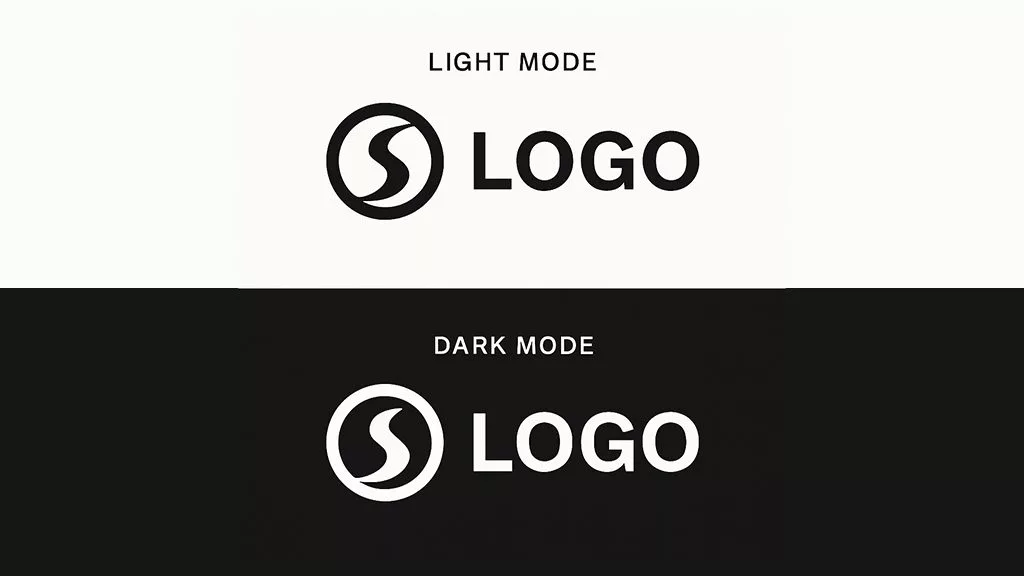
Reversible marks: Create a light version (for dark backgrounds) and a dark version (for light backgrounds). Avoid outlines unless they’re part of the core system.
Contrast checks: Aim for 4.5:1 for text elements in lockups; icons/marks can go lower, but test on real devices.
Favicon & social avatars: Export separate light/dark assets; set the right one per theme where your platform allows it.
File prep: Provide SVG and PNG sets with clear names (e.g., logo-light.svg, logo-dark.svg, icon-light@2x.png). Include a monochrome version for utility use.
Quick audit (5 minutes)
Drop your logo into both a #0B0B0B background and a pure white background.
Shrink to 24px height—can you still read it?
Convert to grayscale—does it still hold up?
Check contrast of any text elements (tagline, wordmark).
View on a phone at arm’s length—does it “punch” or disappear?
My take: A dark‑mode logo isn’t a “second logo.” It’s the same identity expressed responsibly across environments. Brands that plan for this look more premium because nothing feels improvised.
What do you think—does your logo hold up in dark mode?
#BrandDesign #LogoDesign #DarkMode #Accessibility #UX